This blog is for our HCI project, which is mainly about designing a new and innovative product.

Tuesday, March 21, 2006

Project - What we learnt throughout the UCD process

Contributors: Femma, Richard and Sven

Initially when we started this project, we wanted to design a product for Bike Messengers. We wanted to design a fairly hi-tech gadget that would aid them with their day-to-day activities.

We wanted to include features such as:

Galilaeo/GPS tracking
Directions superimposed on glasses
Headset for communication
Route Finder and Map
Task Updates
Weather Information
Games/Karaoke

We made presumptions as to what they would have wanted in such a product, at the time we felt that these features would be very useful to couriers, however this proved not to be the case once we'd done some of our initial research.

From the first set of user feedback, we quickly discovered that bike couriers were very hesitant in investing in hi-tech gadgets as they see their job as very simple and do not wish to complicate it.

Their biggest criticisms of our initial ideas were directed at the route finding system and the superimposing of images on glasses. They felt that they could plan their own routes a lot more efficiently than the route finder as they usually used back routes that are not on maps. They informed us that their route varies with traffic light conditions, and a route finder would not be capable of taking this into account. Their final point was that they knew their town well enough not to need the route finding system, any novice messengers to the company would learn routes well enough within a fortnight.

Although they seemed to be interested in the idea of superimposing directions on glasses, many of them felt that this was too dangerous as it removed their attention away from their surroundings and covers potentially dangerous obstacles.

Generally, what we discovered throughout the UCD process was that our perception of what they wanted was very different to what they actually wanted. Throughout the course of the project we have moved from something very hi-tech, complex and very feature laden to something more simplistic and agile. We had anticipated in completely replacing their paper based system, however we quickly discovered this is not what they wanted. They preferred the paper based system because they felt it worked really well for them. The only real functionality they wanted in a digital device was one that would provide them with quick access to information about jobs. They also felt that weather information would be very useful. The size of the device was rather important to them as well as the cost. They wanted something small, robust and fairly cheap. We feel that after going through the whole process, our product meets their needs.

We found that the UCD process is a very effective one as opposed to traditional Software Engineering processes, as we have learnt a lot about designing for a particular audience. One of the key things we learnt as designers was that people like simple and intuitive products, rather than complex ones with a varied amounts of functionality. Most of our users didn't like the idea of change either, so designing a product that adds a few extra features to an existing product like a watch was sufficient enough.
Thursday, March 09, 2006

Project - Refined Prototype

Contributors: Femma, Richard and Sven

We have refined our prototype (Richard has spent ages putting all the screens into power point and making it interactive) we would be very grateful if you could test it and either a) leave us feedback in the form of a comment or b) fill in our questionnaire.

The full list of features for the product can be found below:

  • Weather Information

  • Galileo/GPS tracking (which can be turned on and off).

  • Main screen – Overview of active job, weather information and satellite tracking.

  • Lock screen

  • Jobs List

  • - Company address
    - Pick up and drop off list
    - Time of pick up and drop off
    - Site information

  • Clock

  • - Display time
    - Display date
    - Stop watch
    - Countdown timer
    - Calendar


I have also posted a similar entry to the communities listed in this post.

Sunday, March 05, 2006

Badly Designed Coffee Bag

Being an avid coffee drinker and having run out of coffee at home, I decided to go to the supermarket and buy some more (fair trade of course). So I bought some instant coffee and a bag of ground coffee. Now most bags of ground coffee that I have purchased in the past, have been easy to open and have had a resealable sticker so you can seal them up again. This is pretty good, because otherwise it can get messy. However, this bag of coffee I bought was neither easy to open nor was it resealable. I spent ages trying to open it, failing to do so, I picked up a pair of scissors and cut it open at the top. This posed another problem, I had to then go and find tape to seal it up before I could put it in the fridge. This was very annoying. I mean why not jump on the "lets make the bag easy to open and seal back up again" bandwagon like the other coffee companies?

However, there is light at the end of the tunnel, after 15 minutes of fiddling around, I have a nice, strong, black, fair trade cup of coffee with a shot of Irish cream. Very nice! :D

Wednesday, March 01, 2006

Project - Prototype Questionnaire

Contributors: Femma, Richard and Sven

We have devised a questionnaire about our prototype. We would be very grateful if you could fill this out after testing the prototype please.

Thankyou for your help.

Thursday, February 23, 2006

Project - Feedback Request

I have just posted in the Bike Messengers and Bike Pirates communities as well as the Messengers.org and Bike Messengers forums. Now all we need to do is sit and wait for the feedback.

Project - Interactive Prototype

Contributors: Femma, Richard and Sven

We have created an interactive version of our prototype (using Powerpoint). You will have to download the file from here.
We have justified our design decisions in this post, therefore it might be useful to read the post before proceeding to testing our prototype.
We would appreciate feedback on the design. What is good, what is bad and what you feel needs changing or improving. Thanks :)

NB: 1) Our file has been throughly virus scanned using AVG anti virus and is completley safe. 2) In order to run the prorotype successfully you will need to enable macros in powerpoint. 3) Macros will only work on Windows. 4) We are aware that when you click from screen to screen there may be a few inconsistencies (i.e screen may jump very slightly) we are not seeking feedback on those matters, more so on the layout and design.

Wednesday, February 22, 2006

HCI at PC World

Richard and I managed to spend about half an hour at PC world today, just browsing stuff. We came across a few interesting products which I'll blog about from a HCI perspective.

Firstly I'll discuss screens. Many people have LCD display screens, especially for laptops and they're pretty cool. Recently I've been noticing a lot more laptops with the plastic finish on the display screen. Now this is very aesthetically pleasing and looks very cool, however as I was discussing with Richard, I personally found them rather impractical. There are two reasons for why I think they are impractical:

1) You can see your reflection in them and that would annoy me a lot whilst I was working.
2) On a sunny day, the reflection of the sun on the screen would be pretty annoying too.

However, I must admit, the quality of the display looks absolutely amazing.

The next product is the amazingly tiny laptop(not sure if laptop is the right word for it) we saw. I personally am really fond of small, sleek and compact products and this was just that. I found it really impressive that such a small product could be used like a regular laptop, although it was aesthetically pleasing and very convenient portability wise, it has drawbacks too. The main drawback was that due to it's size, everything was very very small. I found that although the web pages and text in general were readable, they would become rather annoying very quickly. It's not the type of product, as a computer scientist, I feel that I could perform tasks like programming or dissertation writing on.
(Unfortunately I can't seem to find the image to show you the product).

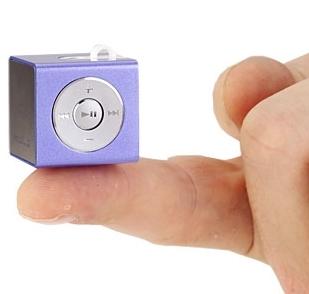
Finally, mp3 players. The one that struck me as very impressive was the mp3 cube (shown below) :
I found it very cool that such a minature product could have quite a huge storage space. The one on display was 512 MB, but I think they go up to 1GB. I would contemplate purchasing this product, however I don't like the fact that it's a cube. I feel a cube is a rather bulky product that would stick out quite a lot in my pocket. If the size stayed the same and it was reduced by half in depth, then I would definately purchase it.

Saturday, February 18, 2006

World's Smallest Drive

I think this would be pretty handy. It's quite impressive how technology has advanced in the past 10-15 years that we can have drives that small. From a HCI point of view it's really cool too. It's very portable and the design is relatively simplistic, not only that but you could also probably store large quantities of data in various formats.

First Mac Trojan

Who would have thought it? One of the reasons I bought my mac was (well besides being brainwashed into buying one, but that's another story) that there were less threats on security. Obviously I was wrong. I guess it's still not as bad as Windows though. Click here for the article.